Dailyhunt
Rebranding activity as a brief for Kyoorius Awards.
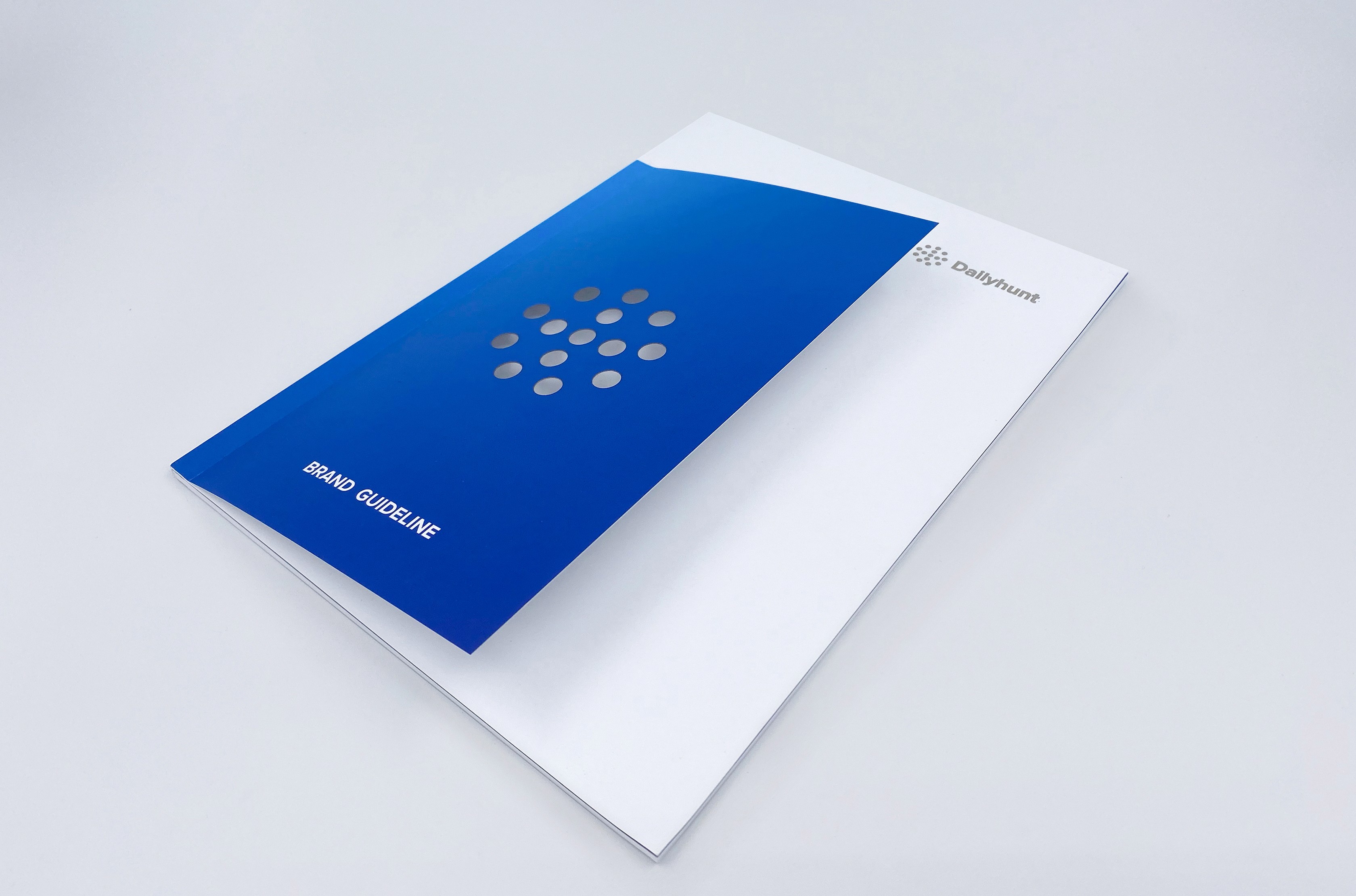
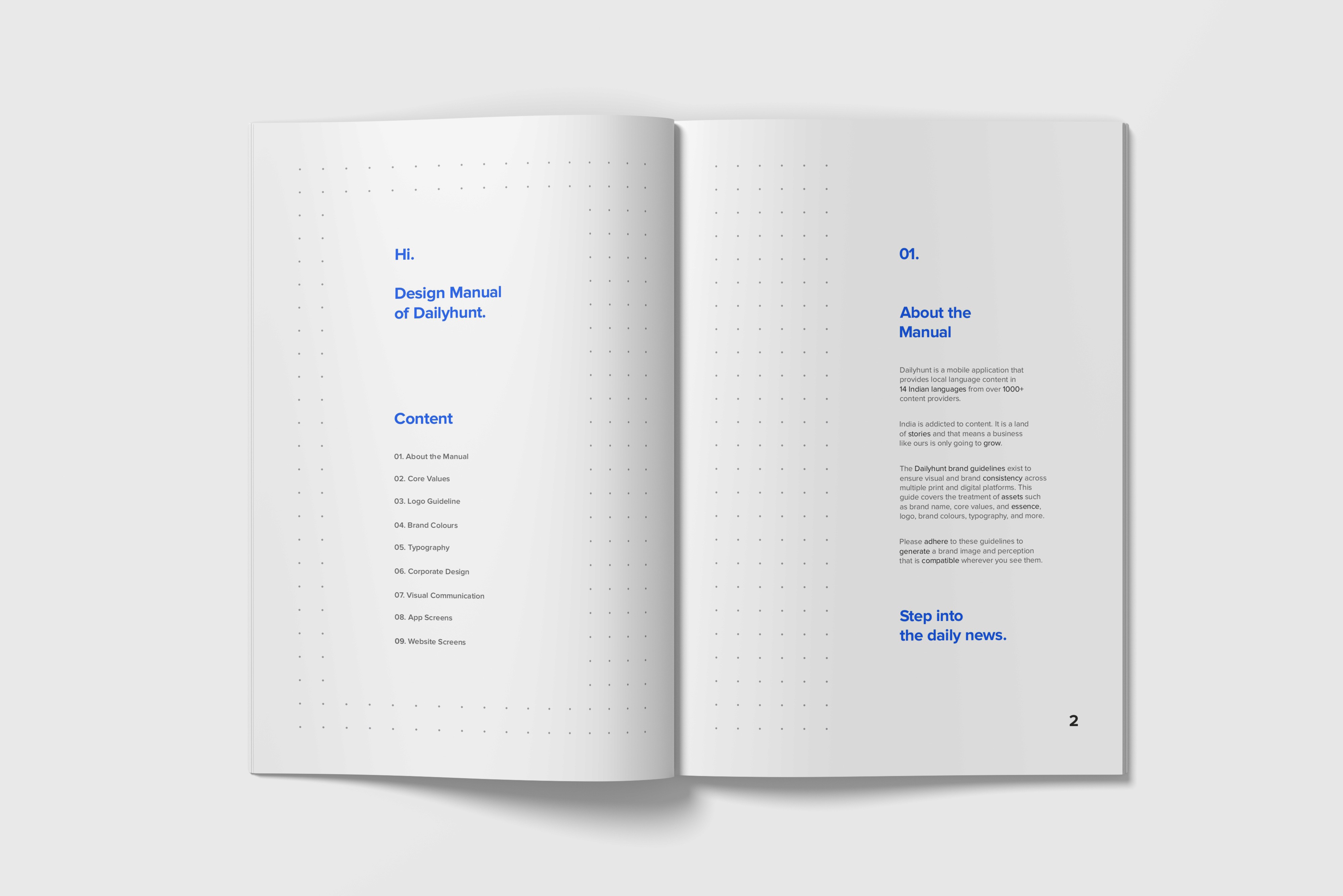
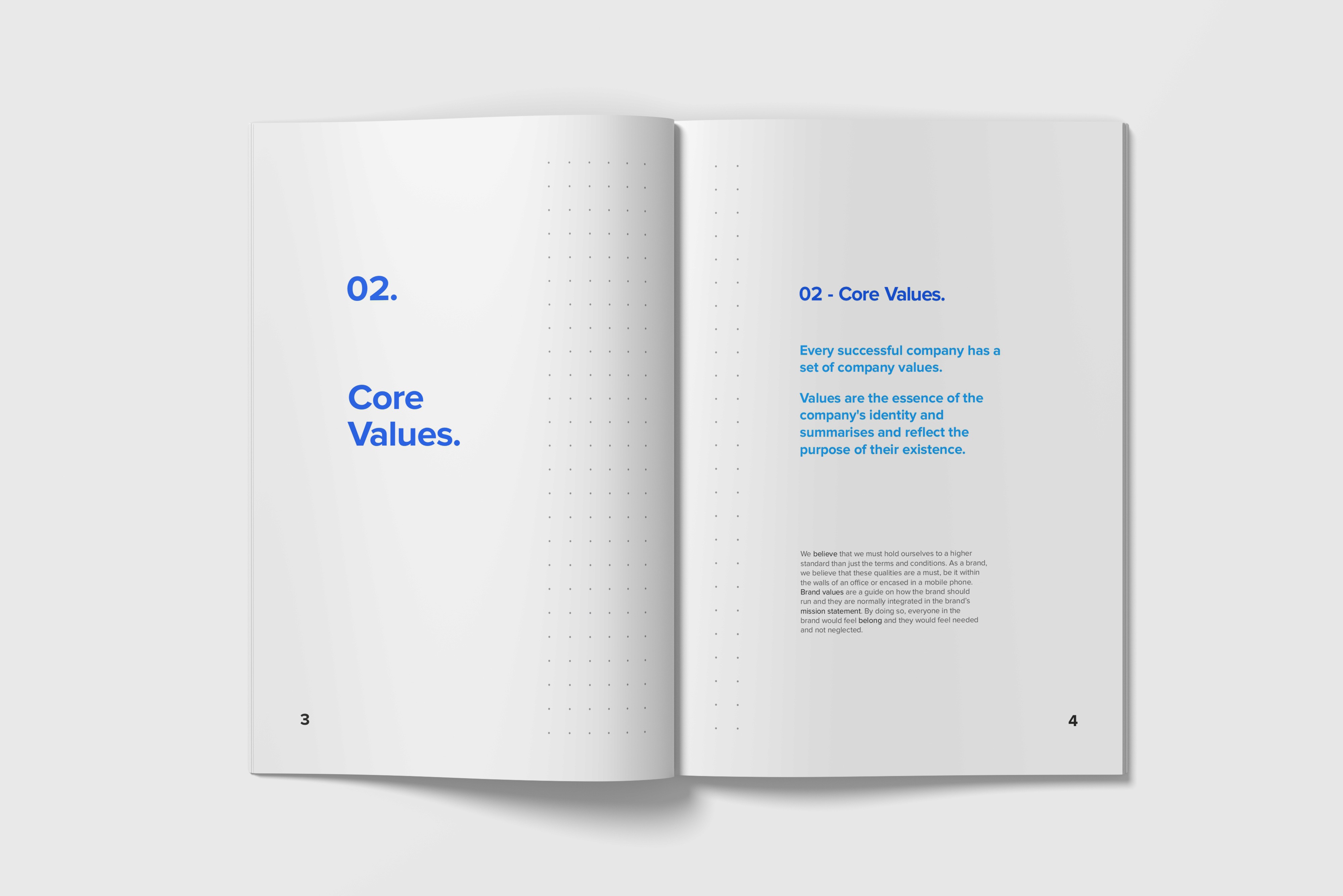
Branding UI/UX Design Brand Book
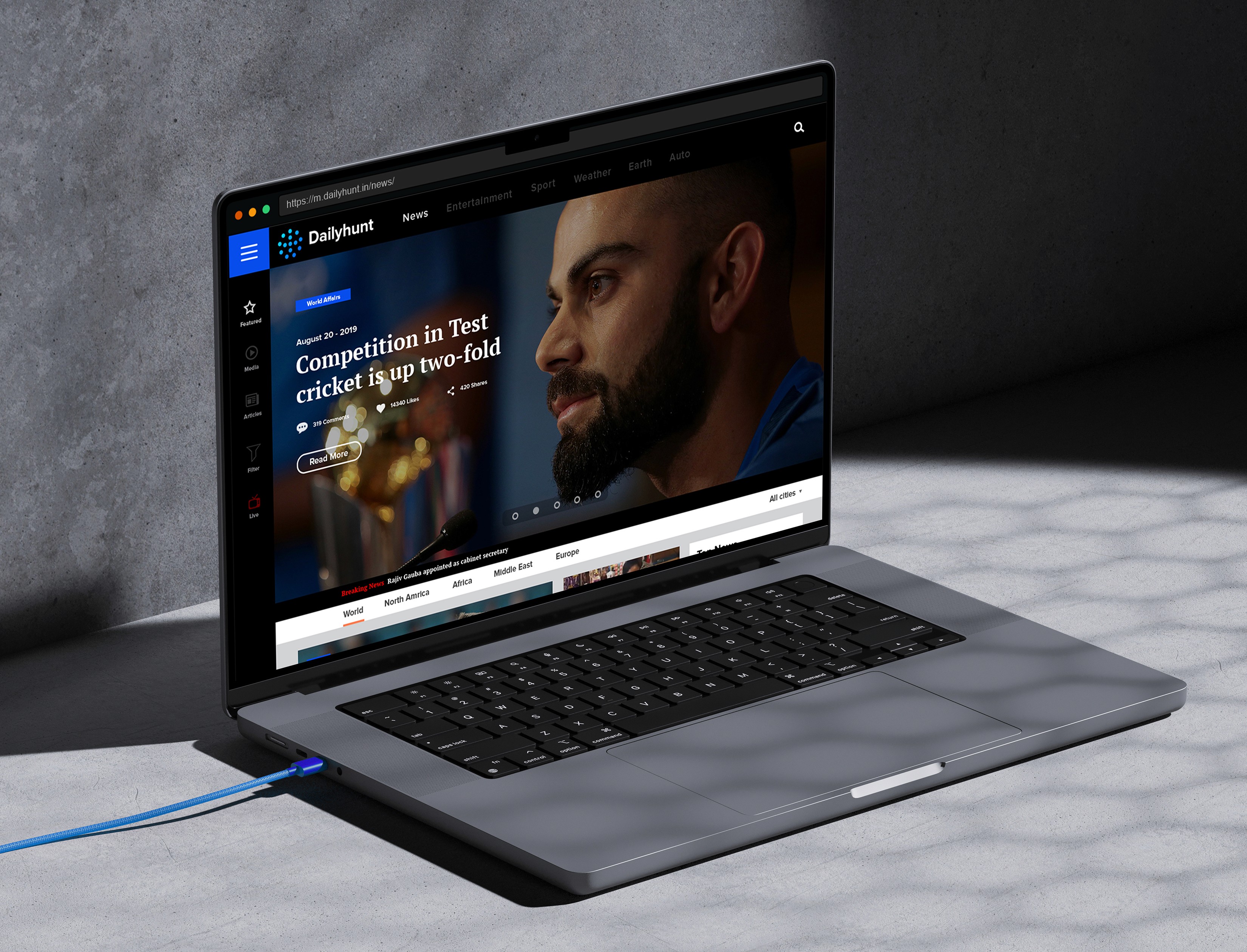
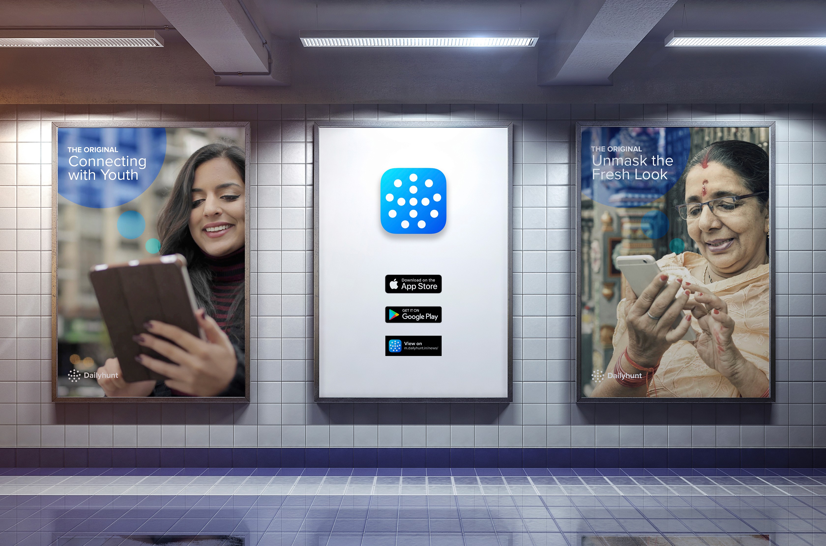
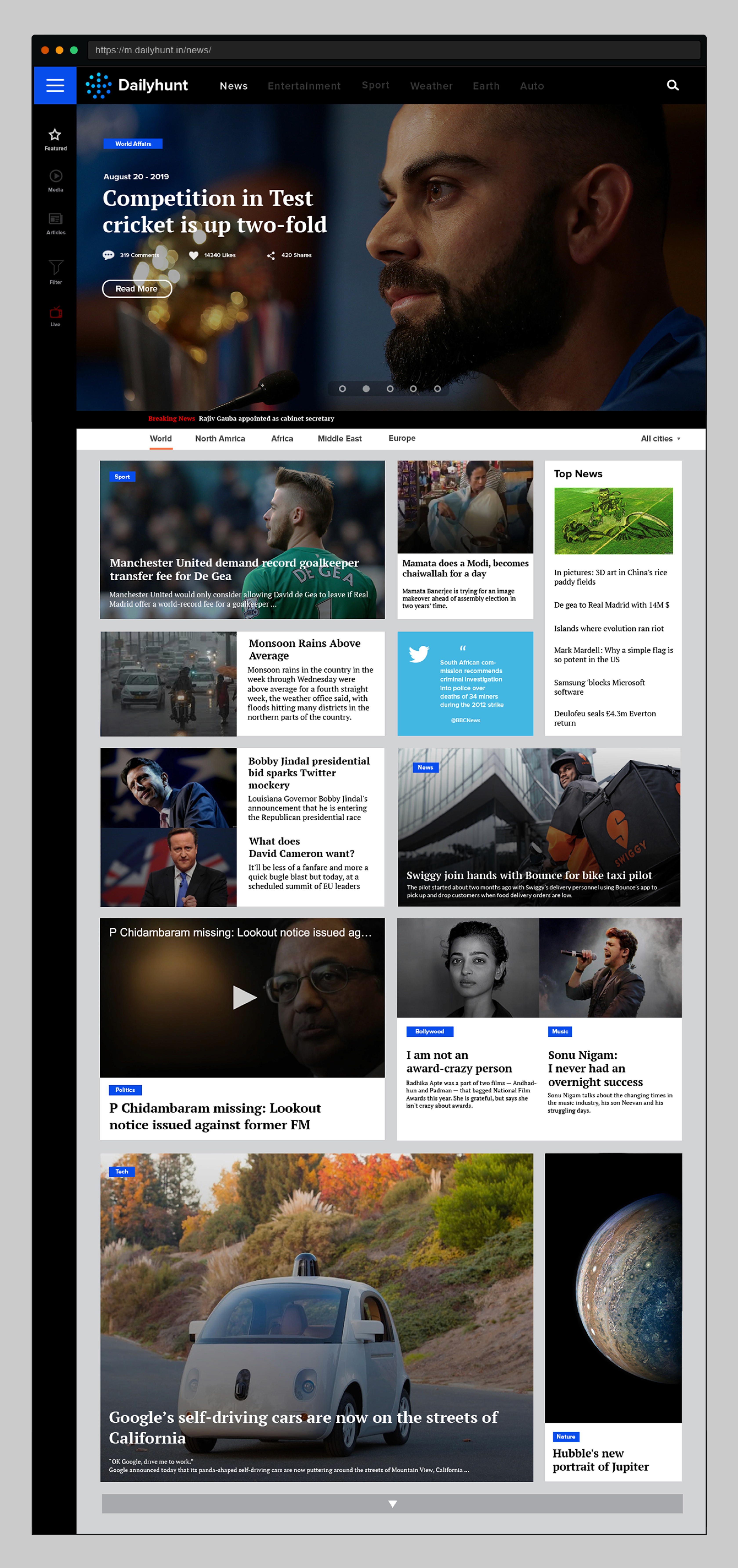
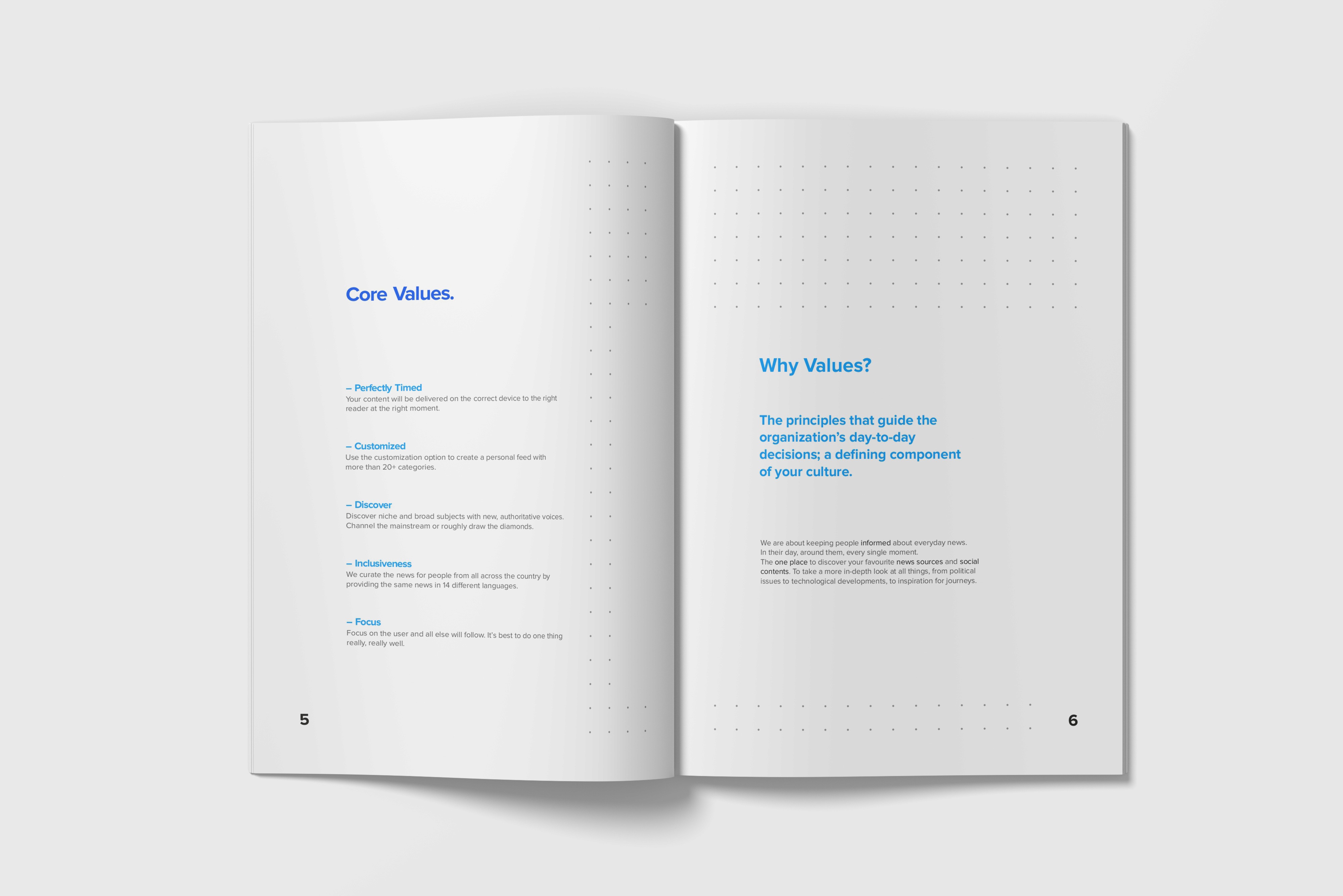
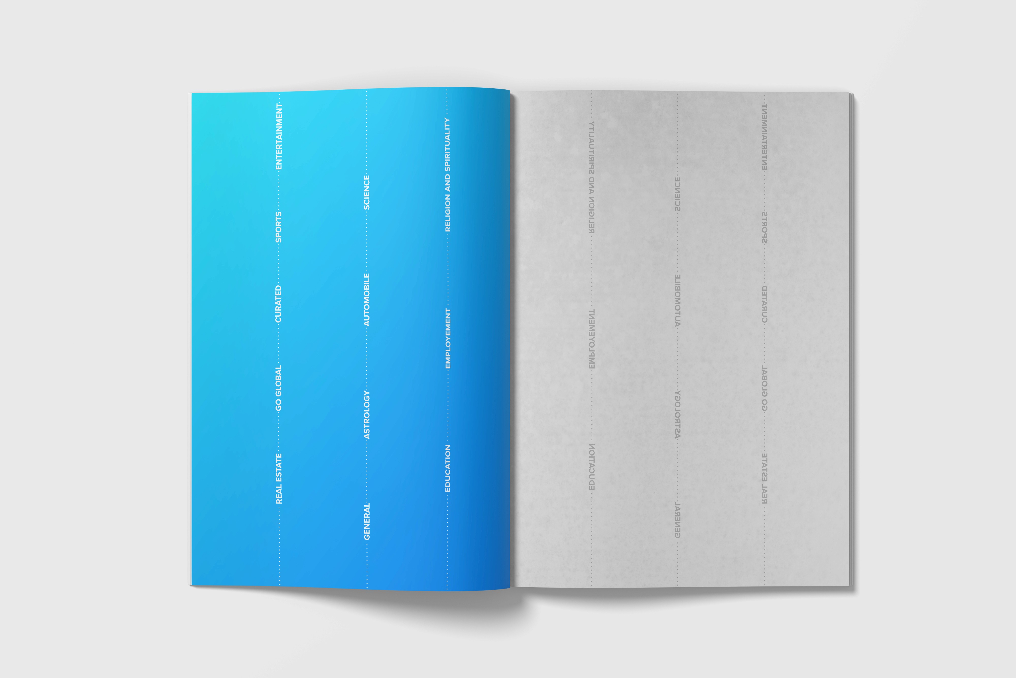
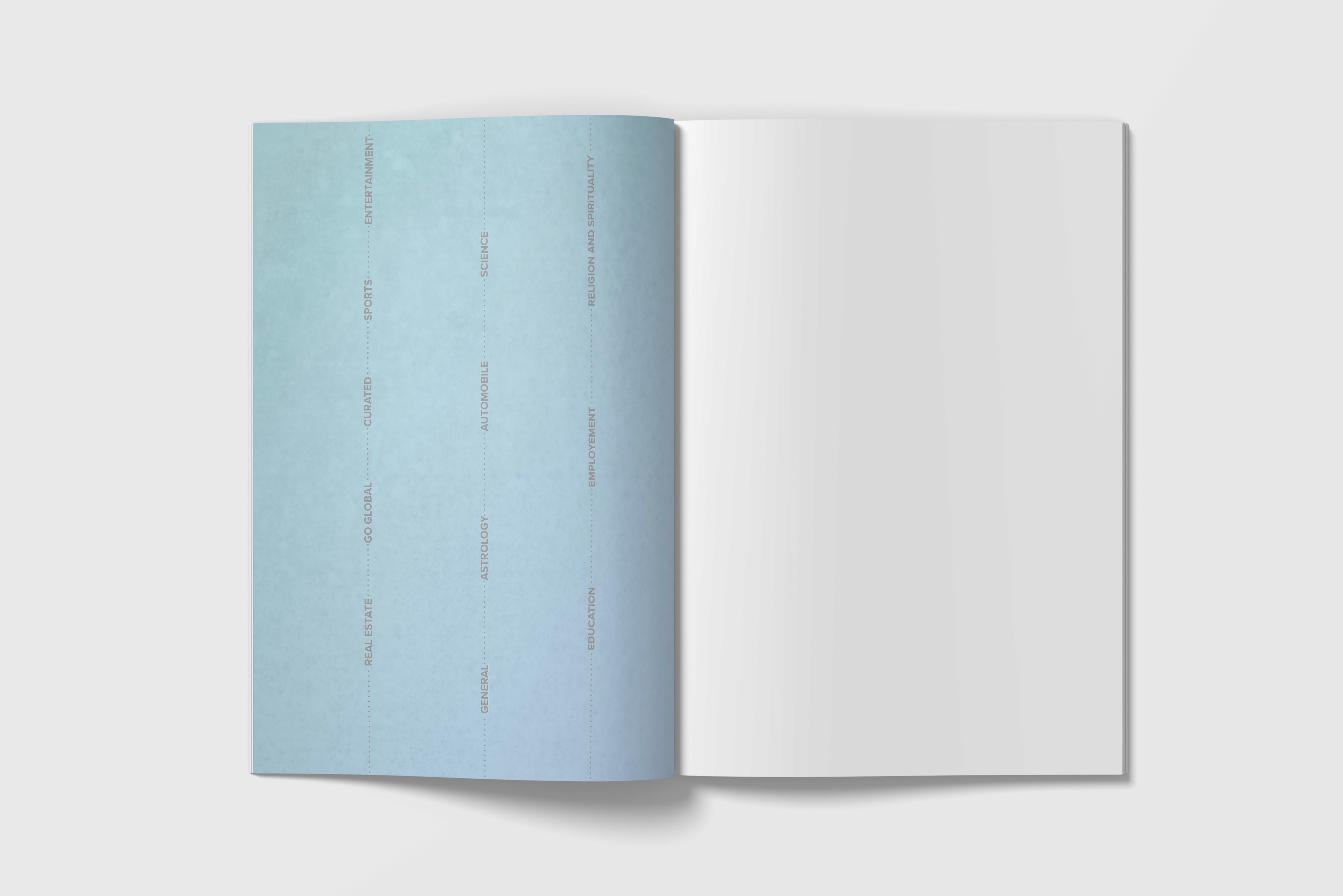
Dailyhunt is a prominent Indian content and news aggregator application headquartered in Bangalore, India. It offers a vast range of local language content in 14 different Indian languages, sourced from multiple content providers.
The project brief originated from the Kyoorius Design Awards, specifically in the Young Blood category. It presented an opportunity to showcase my skills and creativity both as an entry for the awards show and as part of my Design Exploration Studio project during my Masters studies. The objective was to develop a comprehensive branding exercise that not only aligned with the unique selling proposition (USP) of the Dailyhunt brand but also presented a refreshed visual identity capable of resonating with a broader audience.
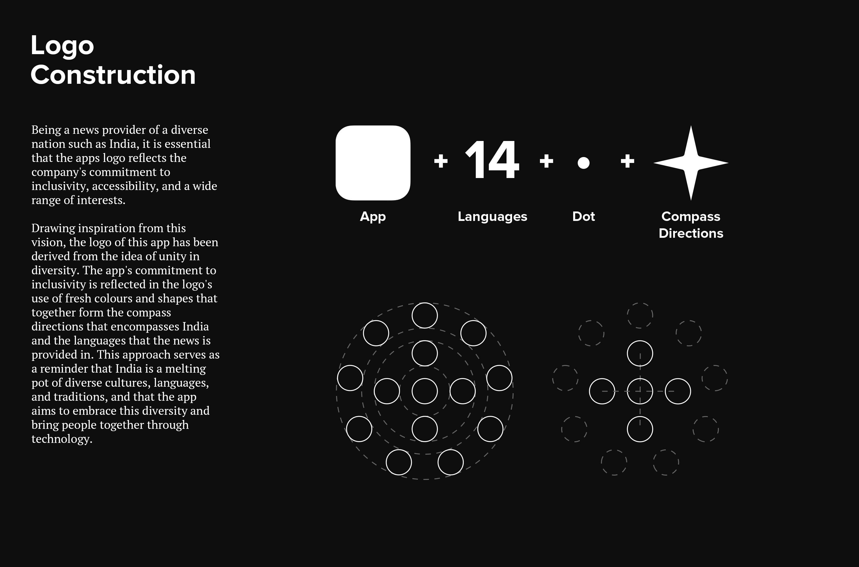
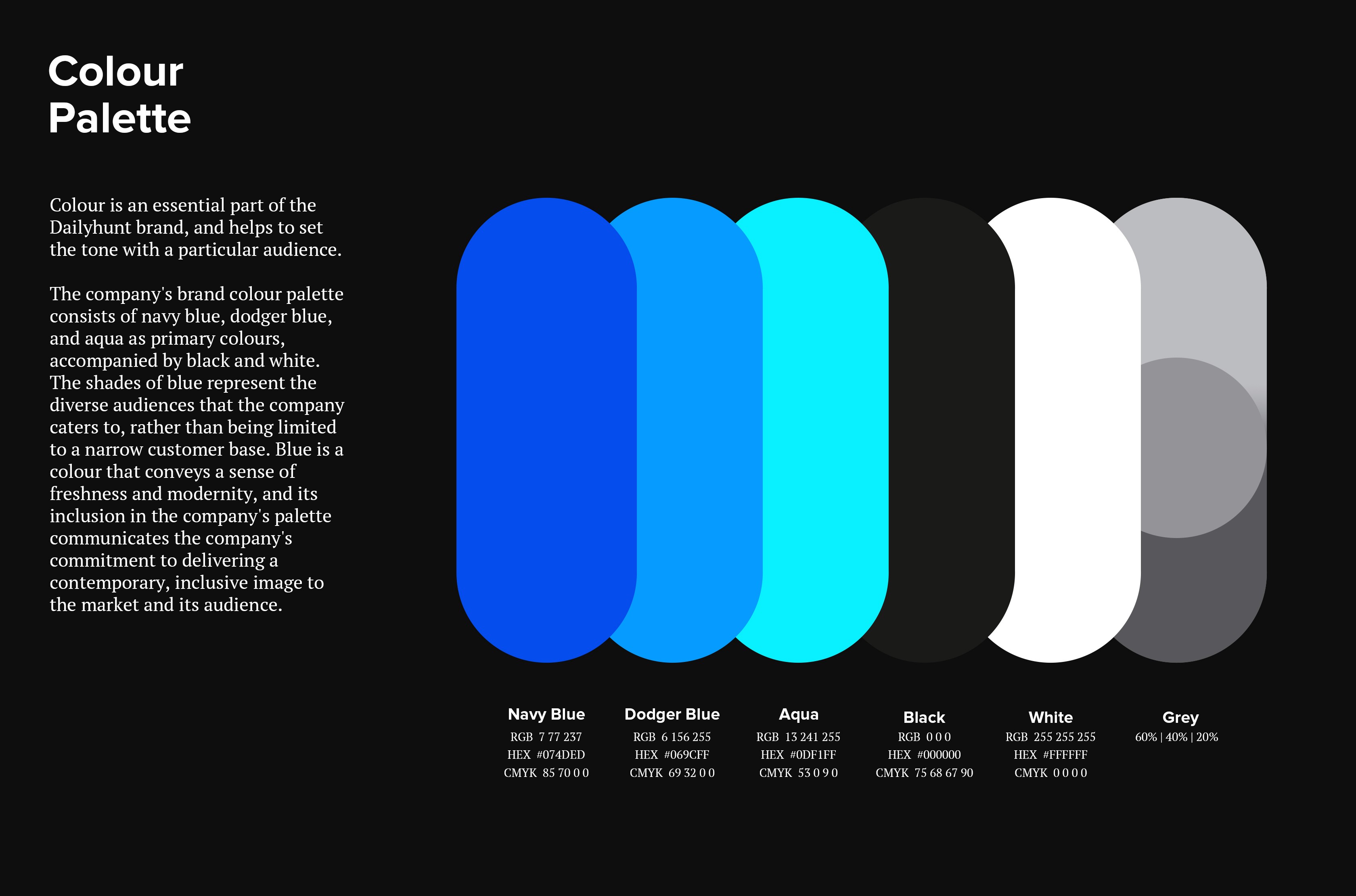
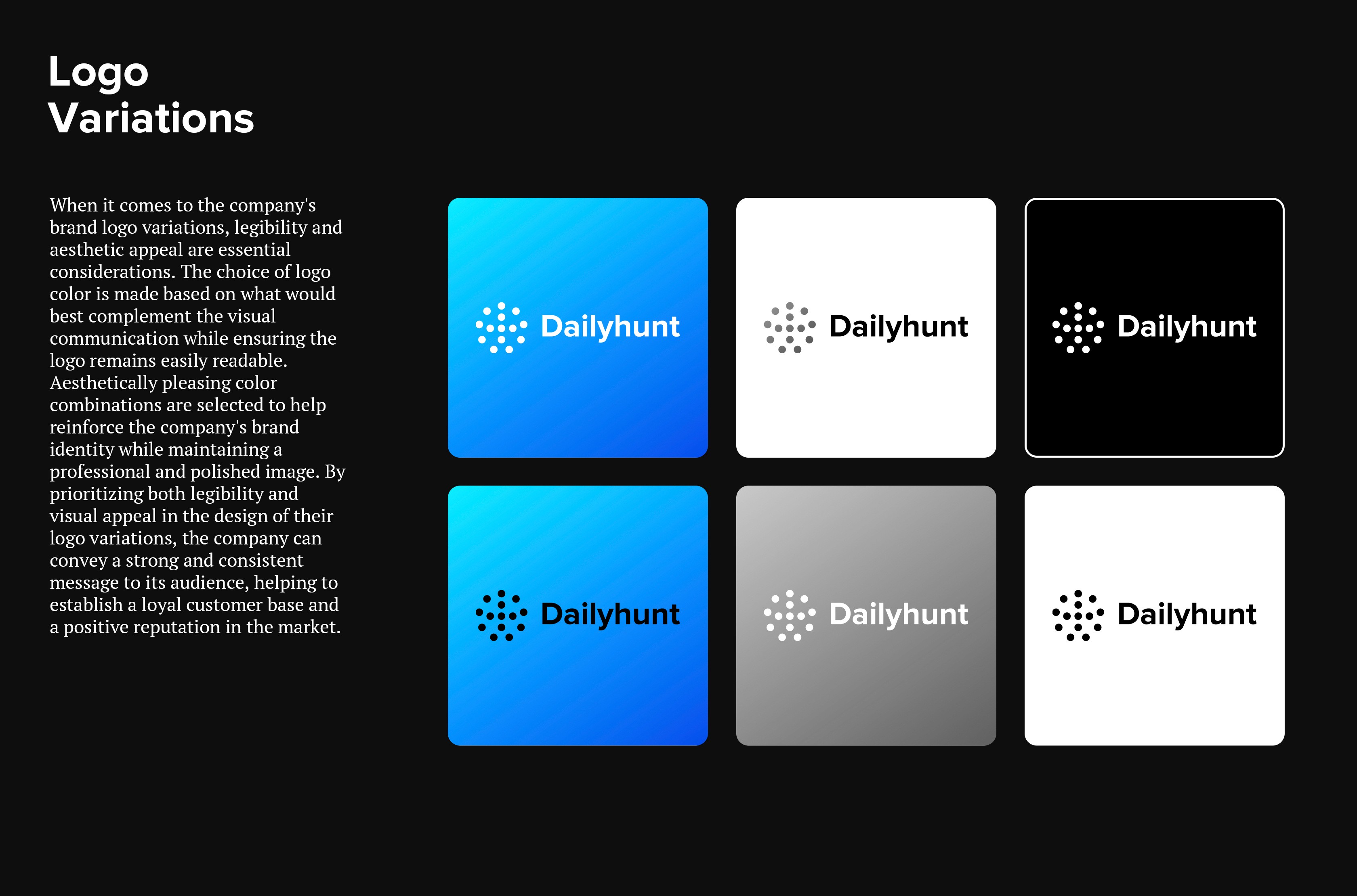
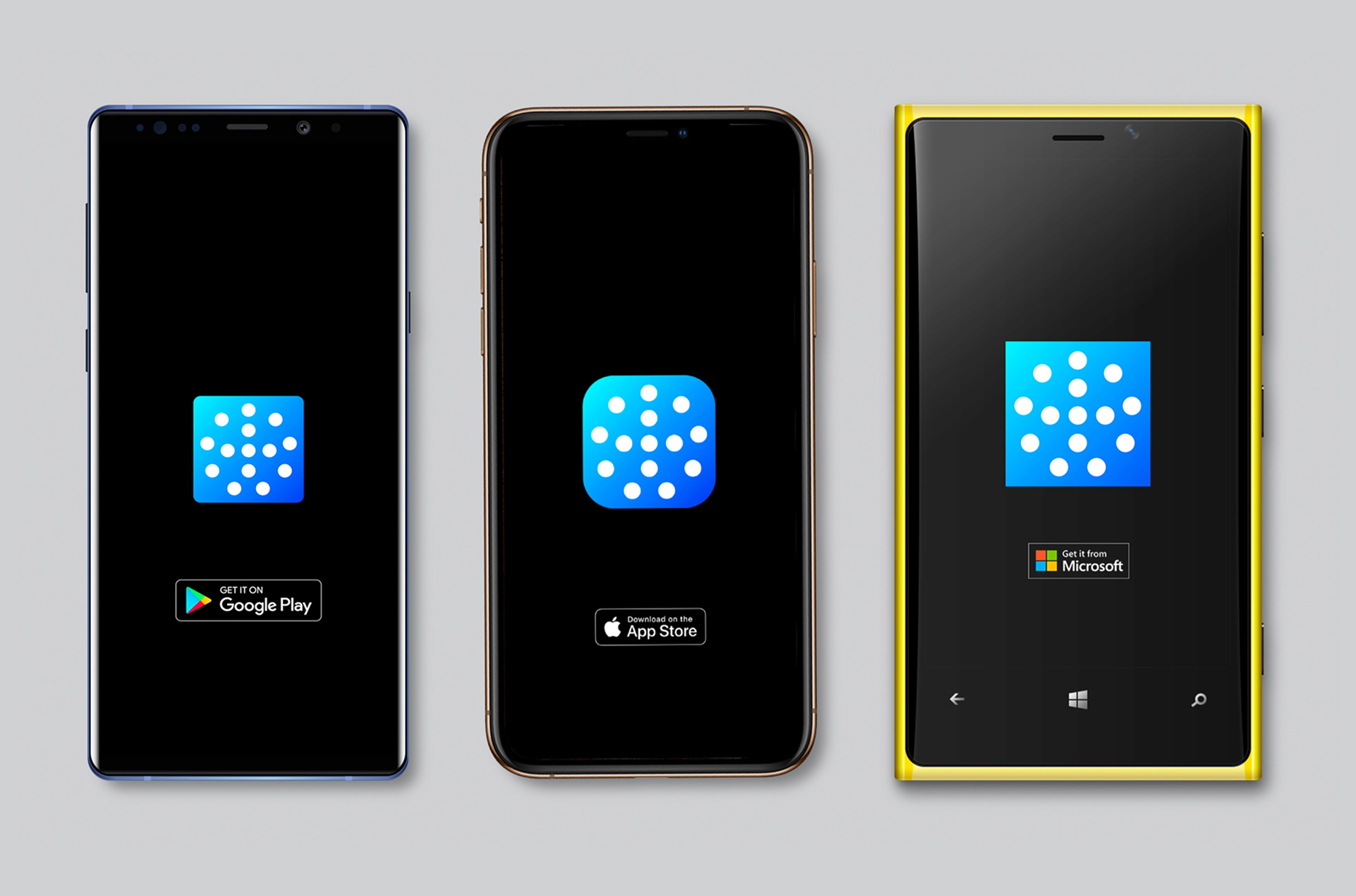
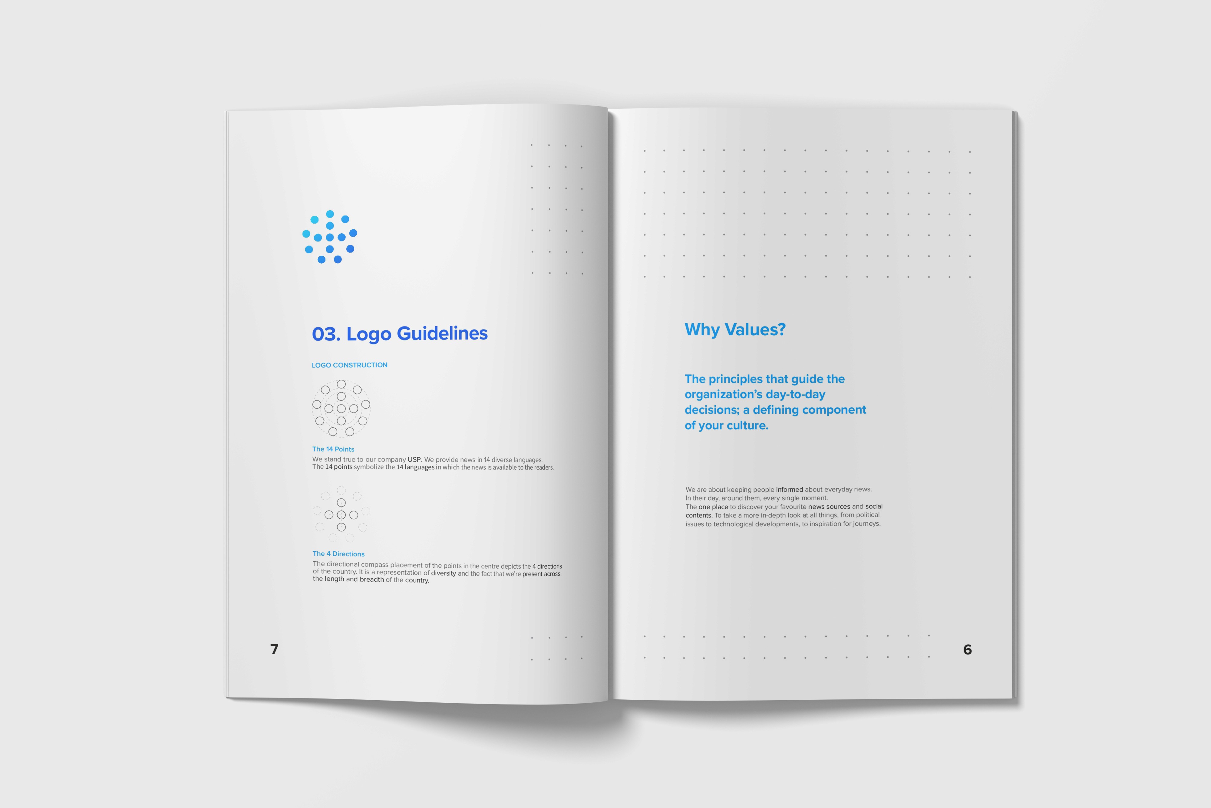
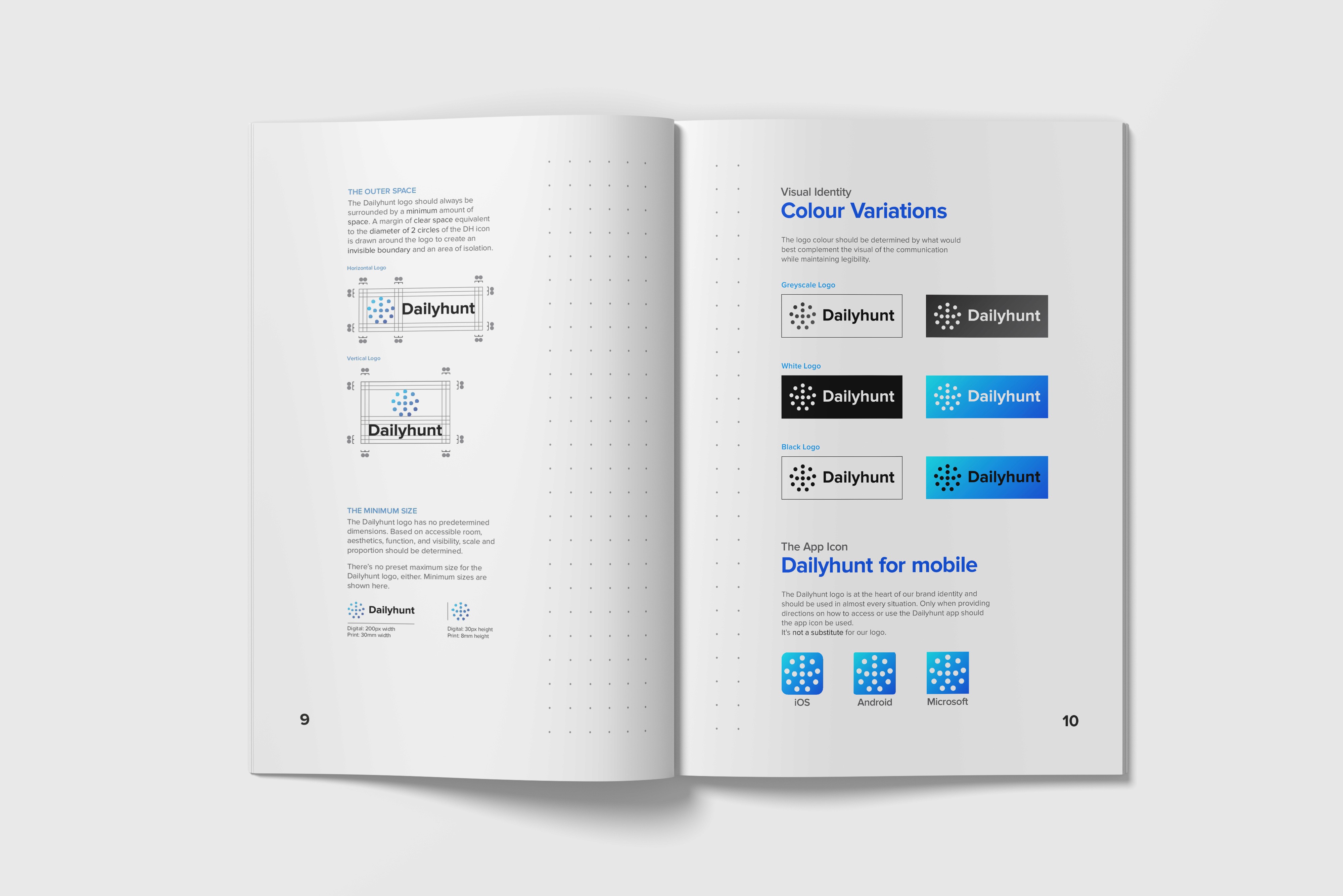
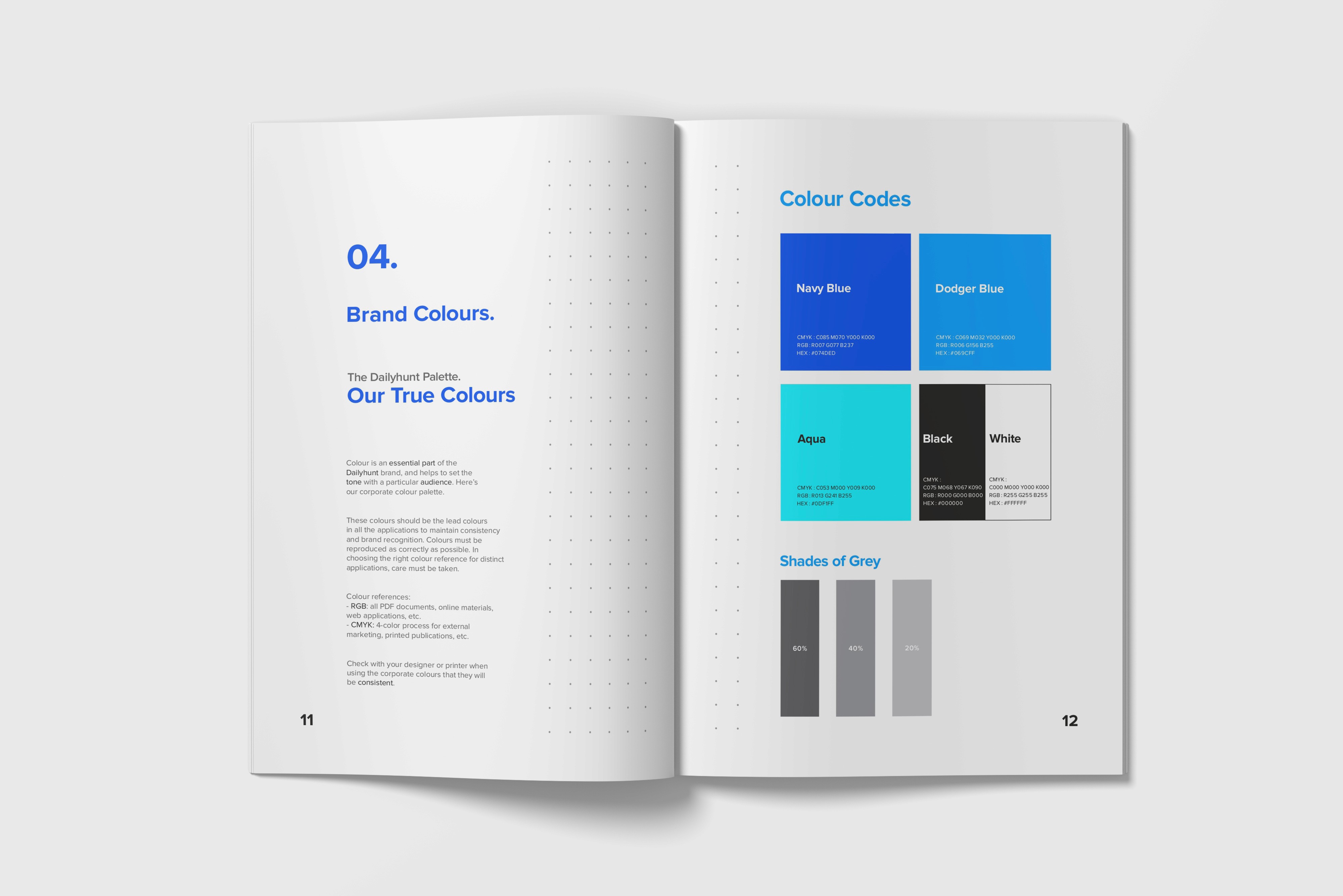
The company's logo draws inspiration from the calming and refreshing qualities of the color blue, as well as its commitment to providing a diverse and inclusive user experience. Blue symbolizes peace, tranquility, and harmony, evoking a sense of calmness and rejuvenation. The company's app offers 14 different languages to cater to the diverse needs of its users in India, along with a range of content and entertainment options for all. The logo's minimalist design features a vibrant shade of blue, conveying a sense of clarity and sophistication that reflects the company's values and commitment to providing a diverse and inclusive user experience.